Business Intelligence
Written By: Sajagan Thirugnanam and Austin Levine
Last Updated on October 6, 2024
Today, organizations are inundated with vast amounts of information. Extracting meaningful insights from this data is crucial for informed decision-making and gaining a competitive edge. Enter dashboards, the transformative tools that unlock insights at a glance through the power of data visualization. Dashboards bring clarity and simplicity to complex datasets by presenting them in visually compelling and intuitive formats. They serve as the lighthouse guiding organizations through the sea of information overload, providing a comprehensive view of key metrics, trends, and patterns. In this article, we delve into the profound impact of dashboards in data visualization and explore how they empower businesses to make data-driven decisions efficiently, swiftly, and with unwavering confidence.
How Dashboards Turn Data into Actionable Insights
Dashboards have the remarkable ability to transform raw data into actionable insights that drive informed decision-making. By presenting complex data in visually appealing and intuitive formats, dashboards allow users to quickly grasp key information and identify trends or patterns. With interactive elements such as filters, drill-down options, and real-time updates, dashboards enable users to delve deeper into the data and extract valuable insights. Whether it's sales performance, customer behavior, or operational efficiency, dashboards consolidate relevant metrics into a single view, facilitating a comprehensive understanding of the current state of affairs.
The Benefits of Using Dashboards for Data Visualization
Using dashboards for data visualization offers numerous benefits that can significantly enhance an organization's decision-making process. Firstly, dashboards provide a clear and concise representation of data, making it easier to understand complex information at a glance. Additionally, dashboards enhance data accessibility and collaboration by providing a centralized platform where stakeholders can view and interact with relevant data. This facilitates transparency, fosters collaboration, and aligns teams towards common goals. Finally, dashboards empower users to customize their data views, tailoring the information to their specific needs. With the ability to drill down into details or zoom out for a high-level overview, users can focus on the most critical aspects of their data.
How to Choose the Right Dashboard Tool for Your Needs
When selecting the right dashboard tool for your needs, consider the following factors:
Budget: Dashboard tools can range in price from free to hundreds of dollars per month. It's important to set a budget before you start your search so that you don't overspend.
Data Sources: The dashboard tool you choose should be able to connect to the data sources you need to track. This could include your CRM, accounting software, or other business applications.
Team's Skills: If you have a team of data analysts or developers, you may need a dashboard tool that offers more advanced features. However, if you're looking for a tool that's easy to use for non-technical users, there are plenty of options available.
Desired features: Some dashboard tools offer a wide range of features, while others are more focused on specific tasks. Take some time to think about the features you need and want in a dashboard tool before you start your search.
Company's size and industry: If you're a small business, you may need a dashboard tool that's easy to set up and use. Larger businesses with more complex data requirements may need a tool with more advanced features.
Here are a few popular dashboard tools to consider:
Power BI: Power BI is a Microsoft product that's tightly integrated with other Microsoft products, such as Excel and Azure. It's a good choice for businesses that already use Microsoft products.
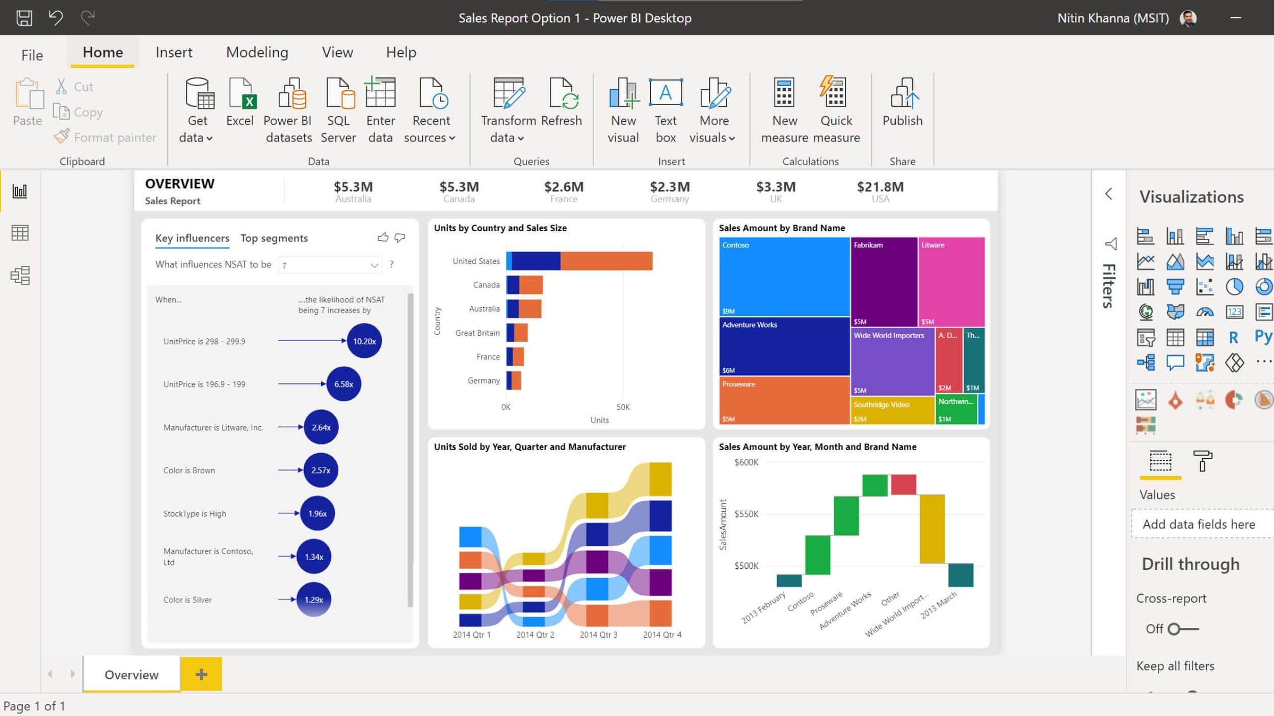
Source : microsoft.com
Tableau: Tableau is a popular data visualization tool that offers a wide range of features and customization options. It's a good choice for businesses of all sizes and industries.
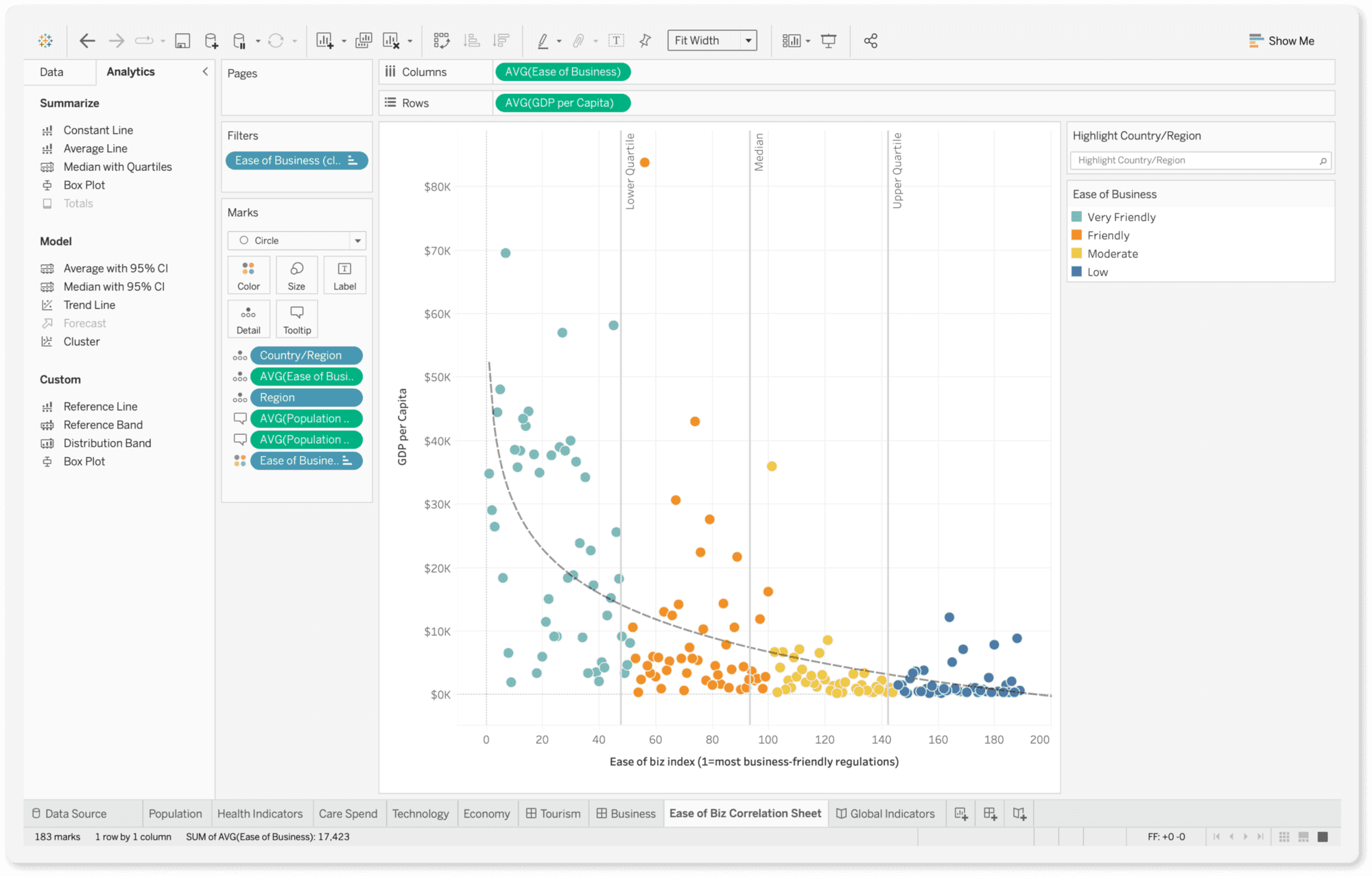
Source : tableau.com
Qlik Sense: Qlik Sense is a cloud-based dashboard tool that offers a drag-and-drop interface that's easy to use. It's a good choice for businesses that need a quick and easy way to create dashboards.
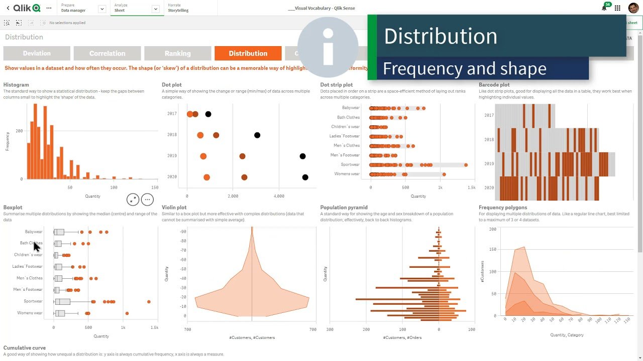
Source : informatec.com
In conclusion, the power of dashboards in data visualization cannot be overstated. These transformative tools have revolutionized the way organizations understand and utilize their data. By condensing complex datasets into visually appealing and intuitive displays, dashboards enable businesses to unlock valuable insights at a glance. They provide a comprehensive view of key metrics, trends, and patterns, empowering decision-makers to make informed choices swiftly and confidently. Dashboards foster data-driven cultures within organizations, where information is transformed into actionable knowledge, leading to improved performance, enhanced efficiency, and a competitive edge.
Related to Business Intelligence